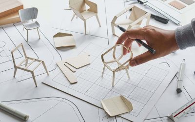
As a graphic designer, I’ve had to fix my fair share of design catastrophes. Do you ever see designs that make you stop & think “what on earth?” Admittedly, most of us have made design blunders when starting out, but once you become established, Microsoft Word designed logos, or clients insisting you cram ten thousand words on an A4 artboard get rather frustrating.
In this article, I will discuss nine common scenarios where graphic design has gone hideously wrong. Good design isn’t always spectacular, but the lousy design will grab your attention like no other. Fortunately, you can do a few things to help salvage the situation. Disclaimer, some designs are so bad they probably won’t ever be acceptable. But the vast majority of design fails can be made passable at the very least. So let’s get discussing!
This article was originally published on https://www.aaloftsdesign.com. If this article appears on any other site other than https://www.aaloftsdesign.com without clear referencing it is a violation of the copyright owned by https://www.aaloftsdesign.com.
This article may contain affiliate links. That means if you click & buy a product, I may receive a small commission at no extra cost to you. AALofts Design is a participant in the Awin Affiliates program, an affiliate advertising program designed to provide a mean for sites to earn advertising fees by advertising & linking to participating merchants. For more information, please view my Privacy Policy & Terms & Conditions Pages.
Problem 1 | Bad Image Quality or Inappropriate Image Choice.
If the images are pixellated or ugly, replace them immediately. This includes everything from low resolution to cheesy stock images circulating Google since it was first launched. There’s not a lot you can do with poor image quality- believe me- I have been forced to try. Once you ditch fuzzy pictures, it is incredible how the project can swiftly improve.
If having a photo is necessary, you could source a replacement image from stock websites such as Creative Market or Shutterstock. A picture speaks a thousand words, so be selective in what you choose to convey your message best. What I wouldn’t do is waste more time trying to fix the unfixable. Consider a minimalist framework if you are lacking in the image department & use fun colour for emphasis. It’s a cliché but less usually is more.
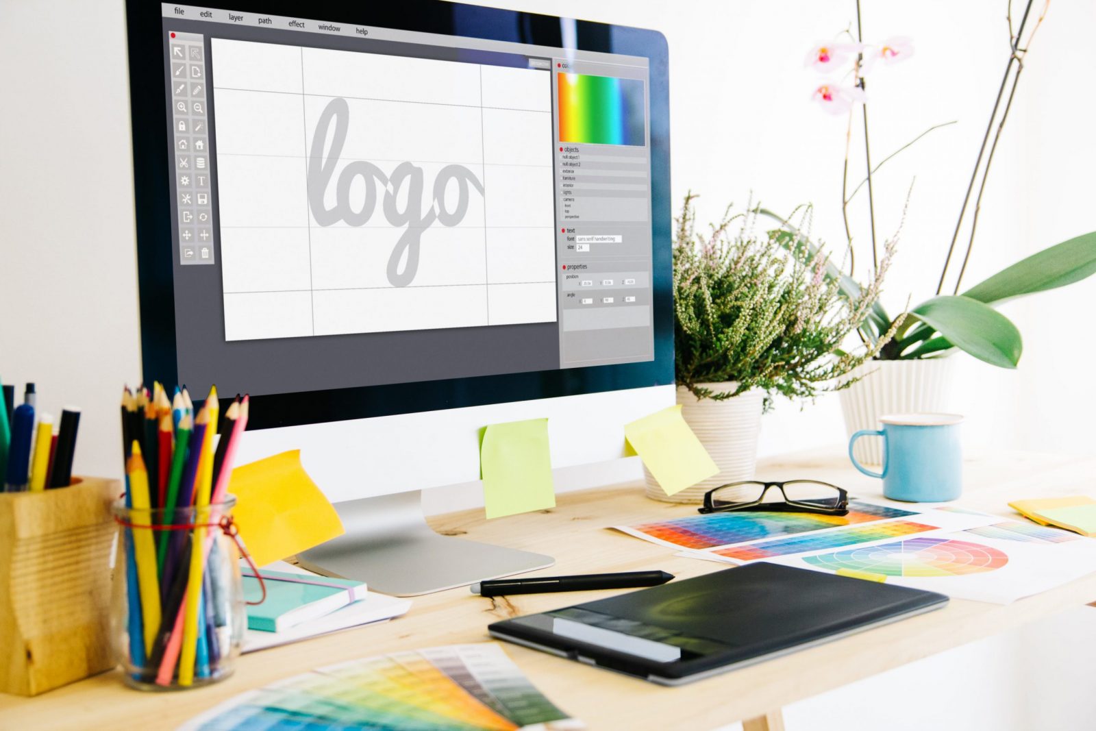
Problem 2 | Terrible Typographical Choices.
Much like how images can set the mood & tone of a composition, selecting the wrong font can make text illegible or communicate an entirely different message to the one intended. Picking the right font impacts both the identity & legibility of a design. So take another look at that font choice.
Sometimes the issue can be too many typefaces & sometimes it is the hierarchy. The fix is to find something that harmonizes with the look & feel for the design. Elegant serif fonts do not belong on a theme park poster & Papyrus makes me think of laminated signs in my dentist’s waiting room- so why is it on a corporate invitation? Also be sure to clean up any misaligned objects, loose or tight leading, & details such as hyphenation or justification.
While we’re at, it stick to a readily available typography palette; usually, your client will have corporate fonts to work with. I find this to be a godsend because otherwise, I might find myself trawling through Font Book for hours only to cycle back to Helvetica. Explore the different options within the font family to ensure that text has a more intentional design.
Finally, look at the words themselves & make sure everything reads well. Is lettering on the part of the canvas that makes sense & is visible? Are calls to action identifiable? Does the typography create a natural flow?
Problem 3 | No One Knows What the Logo is.
For well-known businesses such as Nike, symbols & monograms turn a very business name into a strong identity. But if your client’s business is not as established as these big brands (& these visual identities are built over the years), then you may have a pretty icon that doesn’t resonate with potential customers. You can remedy this situation by keeping things simple, start with a full name & refine the brand identity over time.

Problem 4 | Obscured Letters.
Obscured publication titles created by cropped images are trendy in printed media. It’s cool, it’s creative, but it requires someone highly skilled at compositions. It can be great for brands & publications that people know well, but it has to be carefully executed. If you’re up against time constraints & it didn’t work the first time, I would personally steer clear.
Similarly, stacking text can be a useful typographical approach when designing within narrow parameters or drawing attention to particular words. But I would use it for small chunks of text; otherwise, it can be impossible to read your message. My point with this is that it can take some finessing to get right & project cleanups should be done quickly or not at all.
Problem 5 | The Design is More Crammed Than A London Bus.
Inexperienced people think that white space in a design is the enemy, but add too many components & everyone’s eyes will be hurting in no time. Even if the design isn’t ugly, the message the work is conveying gets misconstrued because, with all that clutter, no one knows where to look. Too much information crammed into a composition is a common designer-client challenge.
Adding white space can help eliminate a cluttered look. But you might have to delete some components of the design to do it. I would start with any decorative elements that do not relate to the main message. Resize or crop images if possible. Think about the size & scale of text & scale it down if possible. Allow plenty of room around the edges of the design & increase spacing between elements. You can also increase text leading or space between blocks of text.
Lack of organization & hierarchy can also lead to a cluttered design. Putting your elements on a grid can solve this issue, creating logical flow & harmony between the canvas elements. For business cards or stickers, start with a thirds grid rule. With small spaces & few features, this might be enough to create harmony.
For larger projects, use a columnar grid. Using equally spaced columns & gutters create a logical placement & flow for text & can help you scale visual elements in the same pattern. Scale everything within the columns & use the gutter-width as a vertical spacing guide.
Other projects require horizontal & vertical spacing, making a square grid necessary. Using a square grid can help create unity between scrolling pages on a website. Use it as the column grid to assist in the placement of items & spacing between elements.
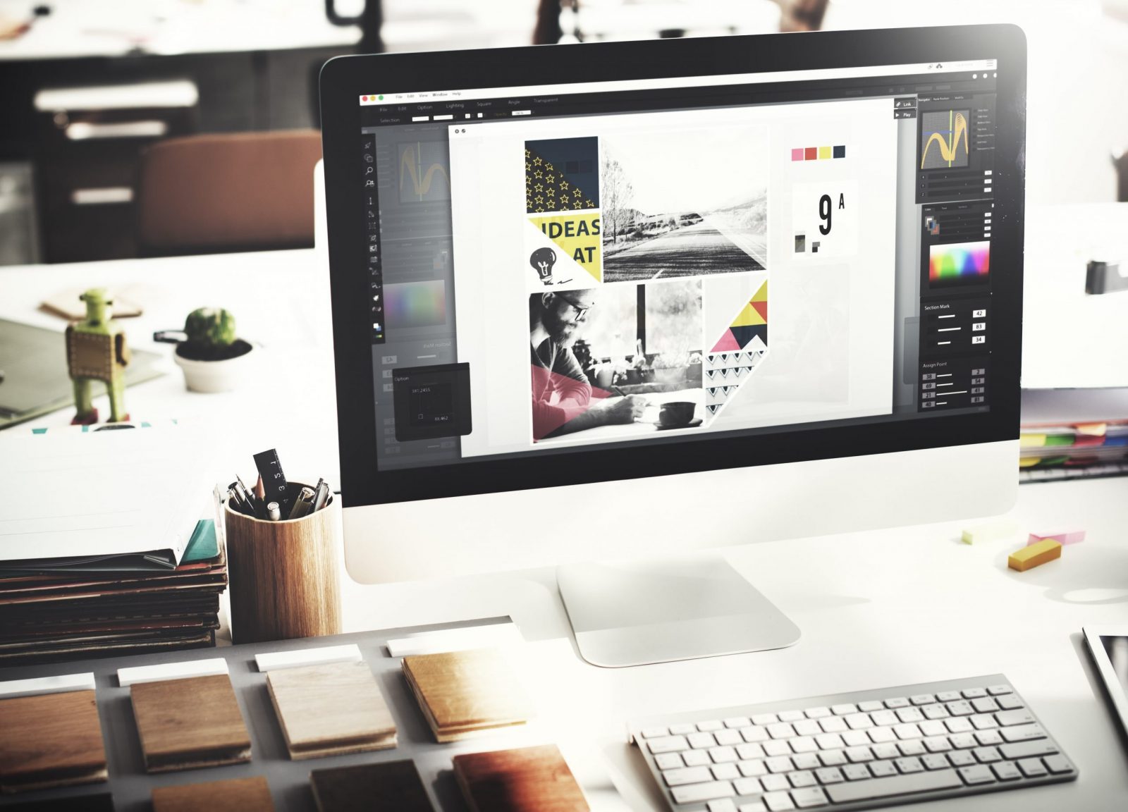
Problem 6 | Nobody Could Decide on A Colour Palette.
Colour can make or break a design. When a design looks busy & you can’t tell why too much colour is often the culprit. Streamline an out of control colour palette by sticking to two to three hues & using schemes based on colour wheel geometry.
Then plan how to use the selected colours. Use a primary colour for dominant use in the project with a secondary colour for emphasis. Consider a third colour for text highlights. In doubt, black & white colour palettes or colour schemes with neutrals stand the test of time. If you’re feeling brave, bright, fully-saturated colour can add a strong focal point by drawing the eye.

Problem 7 | Someone Has Just Discovered the Effects Panel.
I can remember being a kid, sitting in front of a 90’s PC marvelling at all the stamps & effects I could mess around with in Paint. We were easily amused back then, kids! There’s something about discovering new software tools that makes you go all-in with every possible effect you can add.
Consequently, you’re left with a bloated, over-the-top file & a piece of work that passed the stage of looking good a long time ago. *Sigh* when in doubt, strip everything back. Eliminate all the tricks & overdesigned elements. The more stuff you can remove in a crowded design, or with a project that doesn’t look good, the better off you will be.
Problem 8 | Too Much Input.
In my experience, too many people putting their two cents in causes absolute chaos. Don’t get me wrong, you want the consensus to be happy, but if you respond to too many requests without considering how those requests work alongside one another, you’ll end up with an eyesore. The worse thing is when different department members aren’t on the same page. One person thinks this needs to be “bolder” & the other feels the complete opposite.
How do you deal with this? Request that everyone to reestablish their goals & expectations of the project. I find mood board images particularly helpful in articulating specific styles & message tones to non-designers. Remind everyone (including yourself) of the project message & with this information try to streamline the number of instructions you are receiving.
Problem 9 | The Work Has Been Created in the Wrong Software.
Trying to batch edit hundreds of text boxes across multiple pages using ‘Find/Replace’ in Illustrator instead of InDesign is a lot like trying to carve a turkey with a plastic knife. You can do it if you persist, but you’re not going to have a great time of it.
A lot like my complaints of receiving logos in Microsoft Office format, clean up gigs often involve taking a file created in a software that’s not best suited to the task. When you’re faced with this problem, it can sometimes be more efficient to convert file formats (if possible), copy & paste the artwork into the different software (if you can) or (as a last resort), start from scratch.
Depending on the scale & level of detail in the work, you may not have to move the file to a better-suited software at all, or you may have to start from the beginning (sorry!). It may be tedious to do at first, but you will thank yourself later if further edits/ specific format exports are required.
The Final Verdict.
I know it sucks to have another designer’s failings dumped on you, but tasks like these come with the territory. We’ve all got previous creations we pray will never see the light of day again. However, there is a silver lining to this conundrum; the best cleanups should take considerably less time than starting from scratch.
If fixing a design takes too long, then it’s best to go back to the drawing board. Project cleanups should be efficient & should focus more on basics & functionality. Keep the revision simple, streamline over-designed effects, & work to ensure the final product is tidy, aesthetically pleasing & easy to read. Voilà!
If you’re interested in further reading, please see the links to my trusted resources page & related articles below. To find out more about AALofts Design, please click here. If you found this content helpful, want to collaborate on a project, or would like to request an article topic, please click here to get in touch via the contact form. Feel free to share & connect on social media, if you found this content helpful.
